OVERVIEW
U.S. stocks fell across the board last week, with the S&P 500 dropping 1.91%, the Nasdaq falling 0.28%, and the Dow tumbling 3.45%.
The Russell 3000 growth index saw gains of 0.27% for the week, whereas its value counterpart fell more than 4%.
On the international front, developed country stocks dropped 2.41%, and emerging market stocks fell 1.5%.
The Treasury market got bent out of shape last week following the hawkish surprise at the FOMC meeting. The 5s30s curve—meaning the difference between five- and 30-year U.S. Treasury yields—flattened by about 20 basis points in two days. As a result, long-term Treasuries saw large price gains relative to the shorter-duration Treasuries. As for the rest of the bond market, investment-grade bonds rose in price by 0.58%, but high-yield (junk) bonds fell 0.07%, municipal bonds dropped 0.17%, and TIPS decreased 0.38%.
Real assets didn’t fare well for the week. Real estate dropped 3.13%, and commodities tumbled about 4.3%. Although oil rose about 0.6%, gold and corn got crushed, falling 5.88% and 8.3%, respectively.
The U.S. dollar, not surprisingly, rose about 1.9% for the week.
KEY CONSIDERATIONS
The Strongest Technical Pillar – The U.S. stock market slipped a bit last week as investors digested the latest comments from the Federal Reserve. The main takeaway was that the central bank is starting to think more seriously about potentially raising rates sooner than expected. The stock market didn’t quite fall apart on the news—but it wasn’t very pleased to hear it, either.
And yet, the S&P 500 index of large-cap stocks was only about 2% off its all-time high when the week ended. It seems like forever since the S&P 500 was even 5% off its highs, let alone 10% (the technical definition of a correction). A sell-off feels overdue.
With that said, however, we can’t help but acknowledge the strength of the technical backdrop that is propelling this bull market higher. In fact, one could argue that breadth—or the amount of individual stock participation—is the strongest technical pillar supporting this current market.
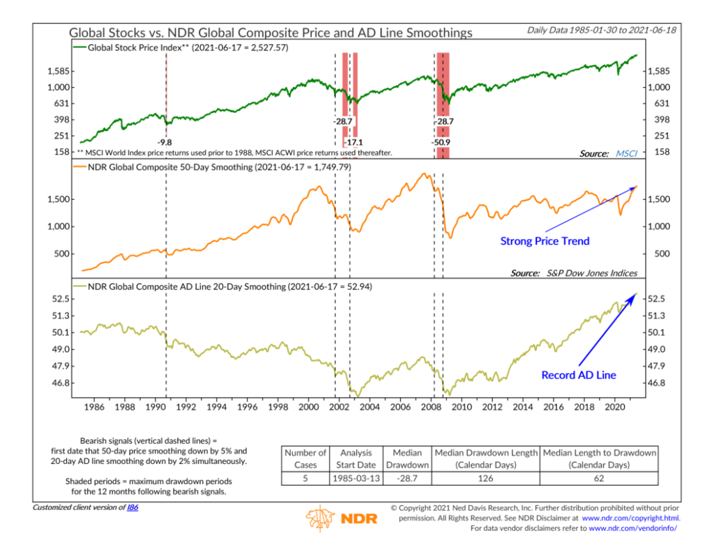
For example, the chart below illustrates what I’m talking about but on a global scale. It looks at both price trend and breadth to gauge whether a significant downturn in global stocks is becoming more likely.

The top clip of the chart shows the performance of an index that tracks global stock prices, and the middle clip shows the average price of this index over the past 50 days. This 50-day moving average (its technical name) is a commonly used way to measure the price trend of a stock market index. As you can see, it’s currently in a powerful uptrend—a good sign!
But it’s in the bottom clip of the chart where the breadth that I referred to comes into play. The gold line represents the 20-day moving average of the global Advance/Decline (AD) Line. The AD Line is the ratio of the volume in advancing stocks to the volume in declining stocks. A rising line, therefore, means more stocks are participating in a rally, a sign of strong breadth. Currently, the line is at an all-time high. You can’t beat that!
This is only one indicator, but I think it does a pretty good job of summing up the state of stock markets both here in the U.S. and worldwide. For the most part, stocks have been in strong uptrends—with rising intermediate- and long-term trendlines—and breadth (participation) has been exceptionally strong.
This could certainly all change on a dime, but the path of inertia that I just spelled out will have to be broken before things get materially worse.
This is intended for informational purposes only and should not be used as the primary basis for an investment decision. Consult an advisor for your personal situation.
Indices mentioned are unmanaged, do not incur fees, and cannot be invested into directly.
Past performance does not guarantee future results.
The post The Strongest Technical Pillar first appeared on NelsonCorp.com.